Building an email list should be your number one priority. Period.
Why?
It allows you to generate traffic and REPEAT customers on demand.
Think about it...
An email list is something people opt into. They actually want to hear from you.
You can build a relationship with your readers. People buy from those they trust.
Your message gets delivered to the place 91% of consumers check everyday - the inbox.
YOU OWN THE LIST.
An email list is the only channel - if nurtured - that will allow you to directly and personally communicate with your audience on an ongoing basis.
It’s essential to building a profitable business.
So, how do you build an email list without breaking the bank?
That’s exactly what I’m going to show you in this post:
25 actionable list building strategies you can use to grow your email list TODAY.
These are the exact strategies I use to grow my email list from zero to 4,476 subscribers in 10 months:

Download a Free PDF of this Guide
+
BONUS 3-Step List Building Formula (Video)
25 Actionable List Building Strategies
This guide will walk you through 25 list building strategies you can use to get more email subscribers today!
Strapped for time? Click one of the jump links below.
#1: Popup Content Upgrades
#2: Convert the "unconfirmers"
#3: Standout with form animations
#4: The Feature Box
#5: Twitter automation
#6: The welcome gate
#7: Two-Step Lightboxes
#8: List building with YouTube cards
#9: Post-specific sidebar offers
#10: Buzzsumo-Twitter hack
#11: In-content forms
#12: Leverage guest post by-lines
#13: Commenters into subscribers
#14: Reverse engineering success
#15: Quick wins with internal links
#16: Exit intent popups
#17: Lead generation cards
#18: Confirmation page
#19: The power of social proof
#20: Double growth with 4 A/B tests
#21: Squeeze pages
#22: Multi-step forms
#23: The Great Pixel Land Rush
#24: Optimizing the About page
#25: Milk the main menu
POPUP CONTENT UPGRADES
Popups:
They might be annoyoing…
But THEY WORK.
For example, two months ago I added this Thrive Leads popup to my blog:

The popup converts at 5.44% and has added 716 new subscribers to my email list in the last 60 days:

In fact, popups add over 450 subscribers to my email list every month.
BUT, let me fill you in on a little secret...
Not all popups are created equal.
In order to maximize conversions you need to add content upgrades to your popups.
It's a content-specific offering tailored to the content of the page that provides instant value to the reader. You know the reader will find it valuable because they are reading the content on the page.
Here's how it works:
You publish an awesome detail-rich blog post and create extra materials like:
- video walk-through
- step-by-step playbook
- checklist
- any additional product that will help the reader
You package the post together with the content upgrade and offer it to your readers in return for their email address.
It can even be something as simple as a PDF of the post.
For example:
In this expert roundup post, SEMrush was rated the #1 keyword research tool by 58 online marketing experts.
I knew some readers would be interested in learning more about the tool.
So, I offered the Ultimate SEMrush Playbook in exchange for an email address.
The playbook walks you through 22 ways to use SEMrush to perform keyword research and competitor analysis:

The popup collected 439 emails, converting at 6.19%:

The playbook performed well because it was relevant and provided instant value to the reader.
And, the best part...
The content upgrade only took me 13 seconds to create!
How?
I converted this post into a PDF using the free Print Friendly and PDF chrome extension (watch the video tutorial).
And connected it to a popup.
Here are a couple other examples of content upgrade popups on this blog...


The overall results?
A 96% increase in conversions and 684 new subscribers added to my email list in the last 30 days:

This list building strategy is almost guaranteed to generate results INSTANTLY.
This video will show you how to create content upgrades and target them to any page on your site in seconds:

TURN "NON-CONFIRMERS" INTO SUBSCRIBERS
How many people are filling out your email forms each day?
5…
10…
25…?
Whatever the number…
20%+ of those people are not actually making it onto your email list.
You’ve worked so hard to promote your blog, drive traffic and get those readers to fill out your opt-in form...
But, some of these people are not getting your confirmation email.
This can happen for a number of reasons...
The email might was mistakenly placed in the person’s SPAM folder…
Or it might have got lost in the daily grind.
Regardless, you owe it yourself to try and convert them again.
After all, they entered their email in the first place so your chances of conversion are MUCH higher now.
Luckily, there is an easy way to do this.
Each morning I open GetResponse and search all the contacts across each of my campaigns. Then, I filter the list by unconfirmed subscribers and sort by date added:

This will give you a list of all the people (from most recent to oldest) who filled out the opt-in form but did NOT click the link in the confirmation email you sent them.
Next, you’ll resend the confirmation link to each person who received the confirmation email in the last 24-48hrs but did NOT click the link:

One minute of work each day gets me an addition 40-50 email subscribers each month.
This is a great "quick win" list building strategy.
CAPTURE ATTENTION WITH FORM ANIMATIONS
What gets your attention more?
This button:
OR
This button:
I'm guessing #2.
First, you capture the readers attention with an animation (you can use this same animation effect on popups, in-content forms, images etc..)
Second, click the button and a content upgrade popup displays.
Learn how to do it in this short video tutorial:
Standing out in a noisy wold
Header bars.
Sidebar widgets.
Popup forms.
In-content.
End-content.
Opt-in forms are everywhere.
The result:
Many of your readers suffer from opt-in blindness.
As they are exposure to more and more opt-in forms they become less receptive to them.
Bottom line:
It's harder than even to capture the attention of your readers.
Enter…
Animations.
A great way to visually capture your reader’s attention as they consume your content.
You can use Thrive Leads to quickly:
- Animate the entrance/ mouse over/ click of an item
- Trigger light boxes on click/ mouse over/ screen entry
FEATURE BOX
Many people love to point out why Popups “don’t work”...
Despite the data telling a different story.
As a matter of fact, over 70% of the email subscribers on this blog are generated by popups.
The point is, they WORK.
But, if you’re still against them, consider another powerful list building alternative…
The feature box.
It’s a large “box” that sits above your blog content, giving a brief synopsis of what your blog is about and why people will benefit if they subscribe.
Many successful bloggers are using them to grow their email list:


Here is one I've been using on my blog:

This feature box converts at over 4% and has added hundreds of subscribers to my email list:

Why do feature boxes work so well?
Four main reasons:
1) When someone visits your website they know exactly what it is about, and if they’re interested in learning more they’ll likely sign up.
2) Quickly captures the attention of the reader at the top of the page.
3) You're able to place an opt-in form front and center converting the reader as soon as they land on your site. No need to wait for the popup to trigger.
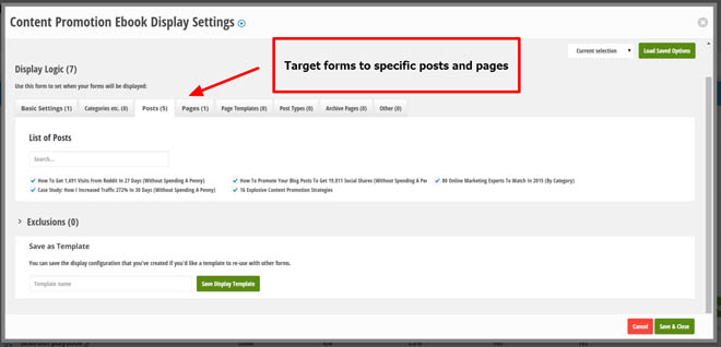
4) You can target feature box messaging to specific posts/pages on your site. A great way to promote your content upgrades.
There are a number of specific features that make this tool so effective:
Targeting capabilities
You can target feature boxes to different posts on your site, effectively turning them into content upgrades:


All you have to do is create a feature box using one of the pre-built templates and select it from the dropdown beneath your WordPress content:


You can even serve different messaging to returning visitors.

Pre-built templates are easy to customize
Creatively challenged?
Me too.
Luckily, Plugmatter provides a library of pre-built templates to get your started.
They are super easy to customize.
Click the element and select the design change from the available options:

All feature box designs are mobile responsive.
A/B testing
You can test different form designs against each other to boost your conversion rates:

TURN YOUR TWITTER ACCOUNT INTO AN AUTOMATED LIST BUILDING MACHINE
Twitter is a great source of email subscribers.
In the last 90 days the channel has added 105 subscribers.

The best part...
I've collected these subscribers on complete autopilot.
How?
A simple 3-step formula:
1) Build your audience with Tweepi
The first step is to build your Twitter following so you have a larger audience to amplify content to.
This is easy with a simple follow/unfollow strategy.
This video will walk you through the entire process I used to get 1,048 new followers in 30 days and increase Twitter referral traffic 159%:
2) Convert followers to subscribers with Crowdfire
After implementing step 1 you should be adding 15-30 new Twitter followers every day.
Now you need to convert as many of your followers into email subscribers.
One way to do this is immediately engage followers and send them to a high converting piece of content.
How?
Use Crowdfire to send followers a private DM as soon as they follow you.
People who follow you back are engaged and MUCH more likely to check out your content (if asked)
For example:
I send followers this DM as soon as they follow me:

The link points to this social media case study.
I get a 10-15% response rate:


Create a bitly link to track clicks and test different DM messaging:

The link shown above has sent 46 people to the case study in the last 30 days.
3) Drive Traffic to your site 24/7 with Tweet Jukebox
If you want to scale this strategy...
You need TRAFFIC.
But, sourcing and scheduling content for your Twitter feed can be extremely time consuming...
Enter Tweet Jukebox.
This tool allows you to recycle old blog content and drive traffic to your site 24/7.
Here is a short video that will give you a quick overview:
Set up the feeds, create a schedule and add your content.
I've sent 628 people to my site in the last 30 days using this exact strategy:

Collecting 26 subscribers at a 4.14% conversion rate.
Not HUGE numbers, but as my Twitter audience grows this strategy will start to scale fast.
THE WELCOME GATE
The homepage is the second most read page on my blog with over 20,000 pageviews…

I’m guessing it's a similar story for your site too.
Check it out.
Go to Google Analytics and navigate to the Behavior >> Site content report:

Most people don’t take advantage of this prime list building real estate.
The first thing most people see when they hit a home page is a hero image, slider or some other generic piece of content.
HUGE waste.
Why not turn your most trafficked page into list building machine.
Take a look at my homepage:

I provide an enticing call-to-action with a couple testimonials from prominent industry experts to immediately
build credibility.
There are a number of great tools out there you can use to quickly add a welcome gate to your homepage.
Sumome just released the “welcome mat”. My friend Noah Kagan covers it in this post:

However, I now use Thrive Content Builder to build all my landing pages.
If you don’t want to create a new landing page, an alternative would be to use the Feature Box plugin (mentioned above).
TWO-STEP LIGHTBOXES
The traditional way to get people to opt in to your email list is to display a form like this:

It works well and is very easy to understand.
You fill out a form and get something in return.
The two-step opt-in process works slightly different.
With the two step opt in you display a link, or button, for the reader to click and then an opt in form appears for them to fill in.
For example:
In this post I use a two-step opt-in form to make a button click trigger a popup to display:

When the reader clicks the button this popup appears:

The reader still needs to put in their email address but they don’t see the form until after they click the button or link.
The logic here is that people are more likely to click a button or a link than enter their email address. After they have clicked a link they have subconsciously committed themselves to the process and are more likely to complete it by filling out the form.
This two-step popup form is converting at 7.05%:

You can take this strategy to another level and use a plugin like Thrive Leads to make any page element trigger an opt-in form...
Such as buttons:
Links:
Click here and see what happens
And images:

By clicking the button, link or image the reader is partially committing themselves to get your offer and will likely fill out the form to complete the process.
It's human psychology!
See how simple it is to make any page element trigger a sign up form in this video:
LIST BUILDING WITH YOUTUBE CARDS
YouTube videos get 4 billion views a day.
50% of those views come from mobile devices.
Up until recently, this was a BIG problem.
Here’s why…
The old way to get clicks from videos was to add annotations - a CTA overlay - to your videos.

The annotations were great for driving traffic to landing pages and collecting emails.
BUT, there was one GIGANTIC weakness…
They didn’t work on mobile!
Enter YouTube Cards.
These puppies are a HUGE advancement for anyone marketing on YouTube.
Because you can now drive traffic from mobile videos back to your site.
Remembering that 50% of YouTube video views happen on mobile devices, this one development has the potential to DOUBLE your traffic (and the number of leads) from YouTube.
So, what do YouTube cards look like?
Here’s a YouTube card showing on one of my Thrive Leads tutorial videos:

When you click the card you’re taken to this page.
Since cards are installed on a per video basis, you can promote content upgrades in all your videos.
Cards can be edited at any time.
How do you set up YouTube cards?
Sign into your YouTube video manager and click “edit’ on the video you want to add the card to:

Select “Cards” from the top menu and hit “Add Card”:

Select the “Associated website” card type and enter the URL related to the video content…
Preferably a squeeze like this one:

Or a sales page if you are promoting affiliate products.
Upload an image (500px x 500px), add a catchy title and call-to-action:

Click save.
You can add up to 5 cards to a video.
What does it look like?
For the first seconds the viewer will see the entire card headline:

After that they will see an “I” when hovering over the video:

When the user clicks the card they will be taken to a targeted squeeze page where you can capture their email address.
That’s it!
You’re ready to start collecting emails from YouTube videos on desktop AND mobile devices.
Note: Your YouTube channel will need to be verified in order to use Cards on your YouTube videos.
BOOST CONVERSIONS WITH POST-SPECIFIC SIDEBAR OFFERS
The top of the sidebar is prime real estate, and for good reason...
Expectation.
Think about 95% of the blogs out there…
The opt-in form is placed at the top of the sidebar.
People EXPECT to see one there.
Your job is to capitalize on this expectation.
Luckily, you have a LOT of options.
Some bloggers will place an opt-in form like this one:

Others will promote a free offer like an ebook or course like this one:

Both work pretty well.
BUT, there is one WEAKNESS with this approach…
It’s not targeted.
Instead of showing the same sidebar form on every post…
Promote a content upgrade.
For example:
I promote promote different ebooks in the sidebar depending on the content:


I’ve collected 144 emails with these two sidebar forms in the last 45 days.
Not popup numbers by any means, but I’ll take it!
How do you set up targeted sidebar offers?
I use Thrive Leads to set this up in minutes.
Within each Lead Group you’ll be able to create a custom sidebar widget:

And target it to specific posts/pages on your site:
You can read a full review here.
THE BUZZSUMO-TWITTER HACK
It's no secret the Twitter ad platform has come a LONG way in recent years!
But, with all the hype around Twitter cards and campaign types…
One list building weapon often goes overlooked.
Tailored audiences.
Similar to facebook custom audiences, tailored audiences allow marketers to target ads to website visitors active on Twitter.
Cool, huh?!
It gets A LOT better.
Because you can now build tailored audiences using Twitter IDs!
This opens up a new world of retargeting possibilities, including the ability to target lead magnets to people who have already shown an expressed interest in a related topic.
For example:
Let’s say I want to build a list of people interested in content promotion and target them with my content promotion ebook.
I’d head over to Buzzsumo and look at the top content related to “content promotion”:

There are a number of posts with several thousand social shares.
Let’s go with the #1 article from Moz and click the “view sharers” tab:

By engaging with a piece of content I can infer these people are interested in the topic and will be much more receptive to my content promotion ebook lead magnet.
Export the list of sharers.
Rinse and repeat for 10 - 15 of the most popular articles.
You can also enter different keyword variations or use advanced twitter search tactics if you run out of content with a lot of social engagement.
Once you’ve exported all the sharers it’s time to build your retargeting list.
Head over to the Twitter Ads platform and select “Audience Manager” from the “Tools” dropdown:

Choose “Twitter IDs” and upload the CSV file.

Create a Twitter ad campaign and use the tailored audience to target people with an expressed interest in the topic of your lead magnet.
These people are MUCH more likely to opt-in to your offer over broad interest-based audiences.
Pro Tip:
Want to steal some of your competitor’s subscribers or customers?
Head over to Buzzsumo and enter the URL of one of your top competitors.
Buzzsumo will return a list of your competitor’s most shared content.
You can then click the “view sharers” button and export a list of all the people who have shared a piece of your competitor’s content.
This is a great way to convert their audience and get yourself in front of a new audience of potential customers.
STAY FRONT AND CENTER WITH IN-CONTENT FORMS
Many website owners will add a form to their sidebar, create a popup and call it a day.
HUGE waste.
Why?
A couple reasons…
First, pretty much every man and their dog has some type of form in their sidebar. As a result, readers are becoming blind to them. In fact, I’ve found them to be one of the lowest converting form types.
Second, you might show a popup form to someone before they are ready to convert.
To build an email list, you need to give readers multiple chances to opt-in (without pissing them off).
Luckily, there is a non-intrusive way to do this…
In-content forms.
Here is a live example:
You embed opt-in forms throughout your content, giving readers the option to opt-in to your email list multiple times as they are consuming your content.
I've collected 261 emails by placing forms within my posts:

Ok, where do I place the forms and how many should I use?
The number of forms you embed will depend largely on the length of your posts.
If you write a 1,000 article, place a form in the middle and at the end of your content.
If you publish long form content (3-7,000 words) like me, placing 3-5 forms through the post is fine.
The logic is simple:
The further a person reads through your content the more interested they are, and more likely they will be to opt in to your list to receive more.
BUT, don't just add generic opt-in forms within your content that say something like "subscribe to get free updates"...
Add content upgrades to boost conversions.
For example:
Content Upgrade post

SEMrush review post

General rule:
Embed a form every 1,000 - 1,500 words and always place one at the end of the post.
If someone reads all the way to the end of a post they liked what they read, and probably want more 🙂
Do you need technical skills to add forms within your posts?
No.
You can use Thrive Leads to add beautifully designed opt-in forms anywhere on your site in seconds...without writing a single line of code.
Learn how in this short video tutorial:
LEVERAGE GUEST POST BY-LINES
You’ve landed a dream guest posting opportunity on a site crawling with your target audience…
You’ve written an epic post you know will blow their socks off…
All you have left to do is write your bio.
In nearly all guest posting cases, you’ll get a byline at the end of the post where you can link out to a page of your choosing.
This is where most bloggers FAIL.
Because they link to their homepage.
Please, don’t make this mistake!
Instead, be laser focused on turning as many of your guest post readers into email subscribers.
What is the best way to do this?
Create a dedicated landing page for each “big” guest post you write.
Here is the Bio I wrote for a recent guest post I did for Digital Marketer:

And here is the landing page it links to:
The headline is personal and immediately grabs the reader’s attention.
As the person reads down the page they are given the opportunity to opt-in and get my content promotion ebook.
Why does this strategy work so well?
A few reasons:
- If someone reads all the way to the end of guest post they likely enjoyed it
- If the reader clicks through to your website they are interested in learning more about you (and what additional value you have to offer)
- Once the reader is on your site they are immediately presented with an opportunity to get MORE epic content 🙂
Make a strong first impression!
Thrive Content Builder is a really helpful tool for this step, especially if want to be able to launch high-converting landing pages without writing any code.
TURN COMMENTERS INTO SUBSCRIBERS
If someone leaves a comment on your blog, it's a good sign...
These people are ENGAGED.
And ready to join your email list to get more.
The only thing left to do is provide an easy way to turn these folks into email subscribers…
There are a couple ways to do this, and it only takes a couple minutes:
1. Comment Redirect Plugin
If you’re using the native commenting system in WordPress, you can install the Comment Redirect plugin and it will redirect first-time commenters to a page of your choice.
Thank the reader for commenting and ask them to subscribe to your email list.
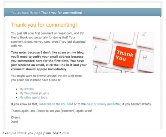
Another option is to use the Yoast Comment Hacks plugin.
2. Subscribers Magnet
Allow readers to opt-in to your email list directly from the comment box.
Here is an example from Brian Dean’s blog:

When a reader checks the box and leaves a comment, they are automatically added to your email list.
If you get a lot of blog comments, this strategy can quickly add hundreds of subscribers to your email list.
REVERSE ENGINEER YOUR COMPETITOR'S SUCCESS
When it comes to building a large email list…
DON'T try to reinvent the wheel.
Learn from your most successful competitors.
And do what they are doing.
Look at 3 things:
1. WHO are your top competitors.
2. WHERE do they get their traffic.
3. HOW are they converting visitors into subscribers.
Once you’re armed with this knowledge you'll have a proven strategy to build off…
And have a MUCH greater chance of success.
How do you find all that information?
Let’s take a look.
1) WHO are your most successful competitors?
Head over to Google and type “top [niche] blogs”:

Write down a list of 5-10.
Next, open up SEMrush and enter your domain’s URL:
Look at the competitors report to see a list of the sites ranking in the top 20 results for common keywords:

Filter by "common keywords" to see which sites are ranking in the top 20 organic search results for the same keywords as your site.
Make a list of the top 5 sites.
Get 21 other competitor analysis tactics here.
2. WHERE do they get traffic from?
Open SimilarWeb and enter the URL of a competitor.
Search the traffic source report and see which channels are sending them the most traffic.

This is where you should focus your initial traffic generation efforts.
3. HOW are competitors converting visitors into subscribers?
Manually look over your competitor’s site.
Pay close attention to the following:
- Form types
- Messaging
- Lead magnets
- Form triggers
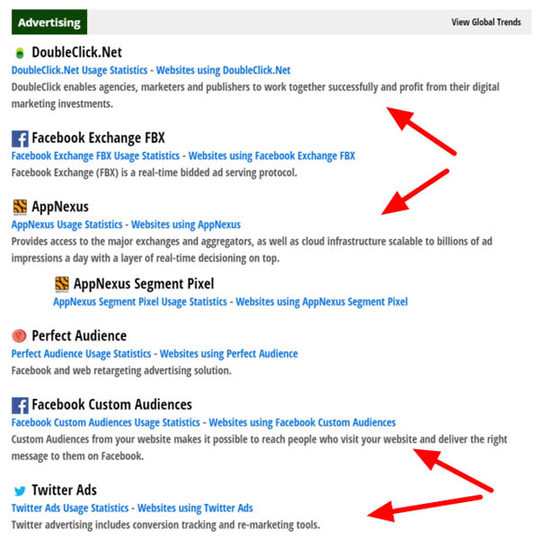
Next, enter the URL into Builtwith.com.
This will show you all the tools competitors are using to optimize their website and run paid ad campaigns.
See if your competitors are using retargeting…
And if so, which channels:
Once you’ve collected this information you’ll be armed with a proven formula to drive traffic and build your email list...right from the start.
GET "QUICK WINS" WITH INTERNAL LINKS
One of the first things I recommend to anyone looking to build their email list faster is to identify QUICK WIN opportunities.
Find content on your site that already converts well and drive MORE traffic to it.
The quickest way to do this?
Internal links.
Open Google Analytics and head to the Behavior >> Landing Pages report:
Set a date range of 60-90 days and select your opt-in goal conversion from the dropdown.
From here you can see that my SEMrush review post is converting at 4.71%:

I want to send more traffic to that post.
Here's how:
First, comb through older content related to the post and look for internal link opportunities.
For example:
In this expert roundup SEMrush is voted the #1 keyword research tool by 58 online marketing experts. This is a perfect opportunity to include a link back to my case study:

Second, call out popular posts or use images to highlight the content in your sidebar:

You can even use an exit intent popup to redirect visitors as they are about to leave your site:

Getting more eyeballs on high converting content is the quickest (and easiest) way to build your email list.
CONVERT ABANDONING USERS WITH EXIT INTENT POPUPS
Get this:
96% of the people visiting your website will leave without buying!
GONE…
Never to be seen again.
Are you doing anything to engage users before they abandon your site?
If not, you’re leaving money on the table - quite a lot of money, actually.
Luckily, there is a solution to the problem.
Exit intent popups.
What are they?
They are popups that appear at the very moment you move your mouse to leave a page...
Join your email list.
This list building strategy is incredibly successful. Why? Well, users often get overwhelmed. And when you present them with a single option it makes the decision much easier.
Exit intent popups give you a second chance to communicate something important to a visitor before they leave your site.
And they’re preferred by many marketers because they don’t interrupt visitors while they are looking around your site.
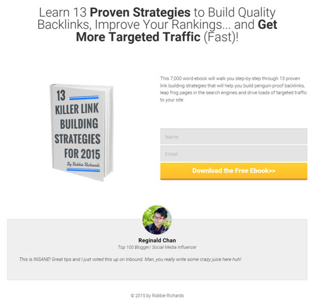
Here is an example:
This popup offers a free ebook covering 13 link building strategies:
It converts at 5.14%.
The key to a successful exit popup hinges on two factors:
1. Relevancy
2. Copy
The offer should be specifically related to the content of the page it is shown on, and the copy should grab the readers attention IMMEDIATELY.
Here are some other examples:
Shopping cart abandonment
Nothing signals buying intent more than someone visiting your shopping cart.
But, cart abandonment is close to 70% for many ecommerce sites.
A simple shopping cart abandonment popup like the ones shown below could easily increase increase your revenues by over 10%:


You can use exit intent popups many different ways:
- Member only promotions
- Promote other content on the site
- Exclusive discounts
- Contest notifications
- Ebooks
Newsletter signups
I even use them to drive traffic to affiliate products:


The key is to KEEP IT SIMPLE and a/b test different design, message and offer types to crank up your conversion rates.
LEAD GENERATION CARDS
You have a laser-focused list of Twitter users ready to target…
Now it’s time to capture their email.
The best way to do this…
Lead Generation cards.
Why?
They make signing up dead simple.
I mean, a user can literally give your their email address without actually typing their email address!
Here is what a Lead Generation card looks like…

When the person clicks the CTA they’ll see a download button with all their information pre-populated:

The email address is pulled directly from your Twitter account contact information.
With a single click, the user’s information - name, Twitter handle and email address - will be passed to you.
Yes, you heard that right…
You can collect a person’s email address directly within the Twitter timeline.
By default, this information will be saved in Twitter Ads for you to export later as a CSV and upload into your email service provider.
BUT, this is less than ideal.
As a marketer, we want to have leads automatically placed into a segmented autoresponder ready to nurture readers to the point of sale.
Luckily, there is a way to do this if your email service provider has an integration with Twitter.
Head back over to the Twitter Ads platform and select “cards” from the dropdown:

Once you have the Card message, image and Call-to-action button filled out:

Open the Data Settings dropdown.
Enter your submit URL - the end point to your CRM or automation system.

If you use Mailchimp, navigate to the “Signup Forms” tab and select “Form Integrations”:

Copy the Submit URL value and paste it into the corresponding field in the Data Settings tab on Twitter.
Make sure the “HTTP method” is set to “POST”:
Finally, you want to provide the custom key names for the user data you want to map to the different fields in your email list.
For example:
I want to remove all barriers for the user and only ask for their email address:

Enter “id” in the hidden data values field and your list-specific Mailchimp ID for the value.
You can find this ID in the Form Integrations section:

Click “Update Card” and you’re ready to rock!
When a user clicks the CTA to download the lead magnet their information will pass straight to your email list, without needing to fill out a single form.
OPTIMIZE YOUR CONFIRMATION PAGE
Bad news:
Up to 25% of the people filling out your sign up form are NOT actually making it onto your email list.
Why?
If you’re using double opt-in sometimes the “confirm your subscription” email gets caught in the spam filter.
Good news:
You can dramatically increase your double opt-in rate by making some simple tweaks to your confirmation page.
For example:
This is the confirmation page readers were immediately redirected to when they filled out my signup form:

It did a nice job of breaking the double opt-in process into 3 simple steps.
BUT...
The page had a 23.45% abandonment rate.
Nearly 1 in 4 people who filled out the signup forms were not making it onto my email list.
So, I decided to follow Brian Dean's advice and optimize my confirmation page:
First, I remind the reader of the benefits of signing up:
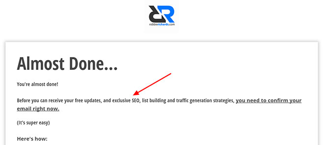
Think about it…
“Free updates, SEO tips, list building and traffic generation strategies” is much more compelling than the “in order to be added to our list click the link below to confirm you email list”.
Second, I visually walk the subscriber through the exact steps they need to take to confirm their email address:


Third, I include a strong call to action.
These written and visual cues will help simplify the process and motivate the user to complete the action.
Pro Tip: Make sure you have forms set up so users are IMMEDIATELY redirected to the confirmation page as soon as they enter their information.
How do you know if the confirmation page is performing well?
A great question.
As with anything in marketing, you will want to test and optimize this page to boost conversions.
One way to measure the effectiveness of the page is to configure a Google Analytics goal conversion funnel so you can see exactly how many people abandon the signup process.
Head over to Google Analytics, click the “Admin” tab and navigate to the “Goals” section:

Click “New Goal”.
Give it a name and select the “Destination” goal type:

Enter the URL path of the page users land on after confirming their email address.
Activate the “Funnel”.
Enter the path of the page people are redirected to right after they enter their email address.
Make sure “Required?” is toggled on:
Hit “Create Goal”.
Now, you’ll be able to see what percentage of people entering their email actually click the link in the confirmation email.
If you have a high abandonment rate, re-think the design and messaging on your confirmation page. Simplify things for the reader as much as possible.
SOCIAL PROOF
Ever asked an expert how to increase your conversion rate…
And got this answer:
“Use social proof.”
Great advice…
But what if you can’t boast numbers like this:

Brian Dean refers to this as the “Social Proof Paradox” in this post.
You need social proof to get subscribers. But you need subscribers to get social proof.
What’s the answer?
Testimonials.
I use them on my welcome page:
My ebook landing pages:

And now I’m starting to test placement in forms:

I don’t care if your blog is only 30 days old and only has 50 subscribers…
With a little hustle, you can get a testimonial.
And, testimonials don’t need to come from big name influencers to pack a punch.
Monitor your Twitter mentions and see if people are commenting on the quality of your work or the content in your newsletter.
Write an epic guest post
I recently wrote a monster guest post for Sumome.
And asked Noah Kagan for a testimonial for the blog:

OR…
If you guest post on a large publication that gets a load of comments, use one of those comments as a testimonial.
It doesn’t have to come from your site.
Just ask for permission. Most people will be happy for you to feature them on your site.
Tap your email list
Send out an email and ask readers to give you feedback.
At the end of the day, anyone can throw a number on the board.
But, you can’t fake a credible testimonial from a real person.
4 SIMPLE A/B TESTS THAT WILL DOUBLE YOUR OPT-IN RATE
When it comes to site optimization…
Draw your own conclusions.
And back them up with DATA.
I can’t tell you how many people have told me “popups only piss people off”…
“You should only show forms 60 seconds after someone lands on your page”…
Blah blah blah…
If I’d taken that advice at face value without testing for myself I would have missed out on THOUSANDS of email subscribers.
For example:
Last week I ran a test and found popups displaying on page load (yes, you read correctly) had a 91.06% higher conversion rate than exit intent popups:

That’s 56 additional subscribers in 7 days by setting up a simple A/B test.
Bottom line…
Every site and audience is different, run A/B tests and you’ll find some surprising winning combinations.
Here 5 things you should be A/B testing:
1. Triggers
A/B test trigger settings - events that need to happen in order to activate the appearance of your opt-in form:
This includes:
- Show on page load
- Show when the user reaches the end of the content
- Show when a user scrolls to a specific part of the content
- Show when the user scrolls to specific percentage down the content
- Show when a user clicks an element
- Show when the user is about to exit the page (exit intent)
- Show after a certain period of time

For example:
In the last 12 days I've found forms showing immediately on page load are converting better than 10 seconds after page load:

2. Display frequency
You’d think showing the same form to the same visitor every time they open a new page would piss them off, right?
Depends…
I consistently see higher opt-in rates setting extremely aggressive display frequencies:
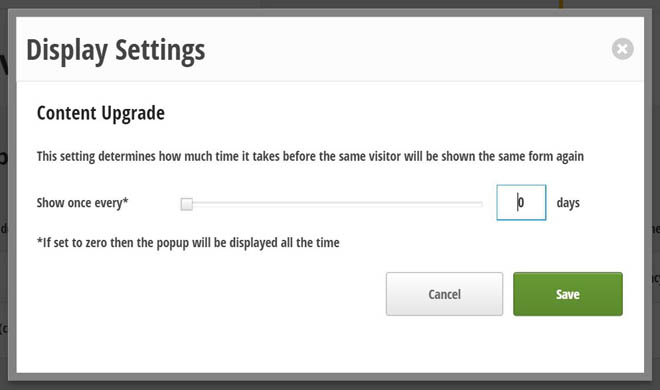
Forms are set to display all the time.
BUT, this might not be the case for you.
Test how much time needs to pass before a visitor will be shown the same form again.
3. Form types
All forms are NOT created equal.
On this blog…
Popups blow all the other form types out of the water.
For example:
This 2-step opt-in form (triggered when somone clicks the button in this post):

Converts at 2.17%:

Compared to the same offer in a popup form converting at 5.12%:

This may or may not be the case for your website, but you’ll never know if you don’t TEST it.
4. Form design/ messaging
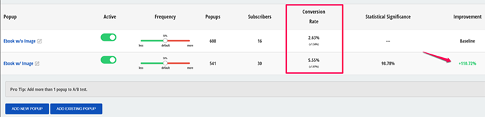
Do you think adding an image to your popup forms will boost the conversion rate?

Versus this one:

Adding an ebook image to the form increased the conversion rate 110.72%:
5. CTA
I’ve got good news and bad news.
Bad news:
Many readers are filling out your opt-in forms only to bail at the last second.
Good news:
It can often be fixed with some simple tweaks to your CTA button copy.
For example:
You may have noticed this CTA button copy on the blog:


Why do I choose not to use traditional button copy, like “submit”, “register”, “sign up” or “join”?
Three reasons:
1) Words like “submit” make you feel like you’re giving in to something (submission!), whereas “Sign up” and “register” sounds like you're committing to something serious.
2) Using copy like “I’m In!”, “Let’s Do This”, “Get Started” standout and make the reader feel like they will receive IMMEDIATE value.
3) Every man and their dog is using this copy.
Instead of a neutral word, use catchy verbs and language reinforcing why the reader is signing up.
For example, if you are giving people a bonus, change the button so the visitor will “Get the bonus”.
Button colors
What do most people do when they see red?
They STOP…
Think…
And take action.
A strong contrasting color will act as a pattern interrupt and have a better chance of catching the eye of the reader.
Test a few different color variations and see if it bumps your conversion rate.
You can use Thrive Leads to quickly launch A/B tests across all your opt-in forms.
Here is a short video showing you how:
CREATE A DEDICATED SQUEEZE PAGE
Create a squeeze page for your newsletter.
The page should be simple, free from distractions and include the following basic elements:
Headline:
Immediately capture the reader’s attention and communicate value. One easy way to do this is ask a question.

Bonus: If possible, include logos of clients or other publications you've written for. This will create credibility with your readers.
Benefits:
Spell out the top benefits the reader will receive after signing up for your email list. Exact numbers work great.
Social proof:
Include logos and testimonials to instantly build credibility with the reader.

CTA:
Only include one crystal clear CTA.
Simple, but effective.
The key is to continually A/B test the landing page to find the highest converting variant.
For example:
Right now I’m testing to see if a 2-step opt-in (covered in #6) will boost conversions.
(In case you missed it)…
A button is displayed instead of a traditional opt-in form, when you click on it a popup displays to capture the email address:

Clicking a button is a smaller intial ask compared to filling out a form.
The psychology…
Once the reader clicks the button they have committed to the opt-in process by signalling their intent to get the benefits of signing up and are MUCH more likely to fill out the form to complete that process.
Three simple ways to drive traffic to your squeeze page
1) Include a link in your main navigation

2) Link to the page from guest post by-lines

3) Call it out in your sidebar
Great, but how do you quickly create squeeze pages?
I created the page above in 7 minutes using the Thrive Content Builder WordPress plugin.
No coding required.
And, if you are design-challenged like myself the tool provides dozens of pre-built templates for any use case (ebooks, sales pages, webinars..and more).

If you’re serious about building your email list, it’s a good idea to get a tool where you can quickly (and easily) create landing pages.
I have dedicated landing pages for all my ebooks:

You might want to do the same 🙂
HARNESS THE POWER OF MULTI-STEP FORMS
How many of you are currently using popup forms that look something like this…
A catchy headline…
Benefit statements…
A form…
And a crystal clear call-to-action.
Standard procedure, right?
Well, there is a “new” kid on the block.
Mult-step (or multiple choice) opt-in forms.
These form types often outperform there more traditional counterparts.
Why?
Micro commitments.
Take this form for example:

Instead of seeing a form show right away, the reader is presented with a button.
A simple ask…
Click the button.
Which immediately causes this popup to display:
Bingo!
But, why is this so different, all you did was add an extra step?
A couple reasons:
1) By clicking the button the user has subconsciously made a micro commitment to get the ebook
2) The user will fill out the form to complete the commitment.
This form converted at 7.05%, capturing 166 emails in 10 days!
BUT, you can take this strategy a step further…
Make your reader feel like an idiot for not opting in.
Here is a [link]Thrive Leads[link] multi-step popup I just launched:

I ask the user a no-brainer question.
Of course they want to double their traffic in the next 30 days!
When the reader clicks the green button this popup displays:

Note the red “No, I don't like traffic” button.
I’m not trying to be a prick and piss people off...
I'm just trying to make them feel silly for not wanting more traffic 🙂
Draw on simple psychology.
The human brain cannot help but engage with a question.
Two options convert much better than one.
JOIN THE GREAT PIXEL LAND RUSH
2015…
The year of the Great Pixel Land Rush.
And it’s a game-changer!

It’s a concept I was introduced to earlier this year at Digital Marketer’s Traffic & Conversion Summit (that's me, my beard with Ryan Deiss)…
Here’s how it works:
1) Publish a blog post
2) Use facebook ads to drive traffic to the post
3) Create a custom audience including all the people visiting the post but NOT signing up to your email list.
What’s so special about this approach?
Instead of sending traffic straight to a squeeze page, you’re using content to create a segmented audience you can promote relevant offers to.
This will help boost click-through rate and conversions, while reducing CPC.
Think about it…
Would you rather market to cold traffic or people who have already read and shown an interest in your content?
Let’s look at an example:
I recently used this facebook ad:

To drive traffic to my Thrive Leads Review.
It was targeted to people interested in email marketing, lead generation etc...
Cold traffic.
I then created a custom audience to capture all the people reading the post but NOT signing up for the content upgrade.
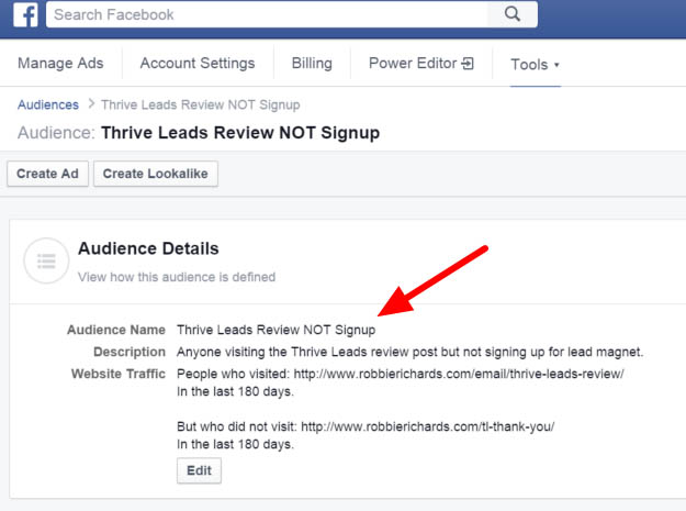
Warm traffic.
Then I retargeted the readers with a relevant offer (in this case an ebook):
Custom audiences are dynamic
You can create a custom audience for each post or category on your blog and it will continually add new people to the lists (no more re-uploading files).

Create a landing page for each post or category's content upgrade and use facebook custom audiences to send warm (targeted traffic) to them.
You can learn more in this post from Digital Marketer.
Pro Tip:
Create a Lookalike audience off your custom audience to expand your reach:

Make sure you set it up on 1% similarity to get the closest match to your existing audience.
TURN YOUR ABOUT PAGE INTO A SQUEEZE PAGE
A lot of people use their about page to tell a story…
Who they are…
Why they’re credible…
Why they started the blog…
And that’s it- the page ends with the story.
HUGE waste.
Why?
Your About Page is probably one of the highest trafficked pages on your site.
If you’re not using it to capture emails you could be leaving gobs of email subscribers on the table.
Think about it…
If someone takes the time to learn more about you, chances are they’ll sign up to your list to learn more from you.
Here is a look at my About Page.
I include a form in the middle:

And at the end of the page:

The page converts at 3.72%.
LEVERAGE YOUR MAIN MENU

The main menu bar is one of the most clicked areas on your site.
Take advantage of the real estate.
Add links to your best content and lead generation materials…
Free courses:

Ebooks:

Resource sections:

If you don’t have any downloadable guides to offer (learn how to create one in 13 seconds), stick with a traditional newsletter page like this one.
This simple strategy will help funnel traffic into your highest converting pages.
Tip: Use keywords in the menu text you know will resonate with your target audience.

Do You Want Even More Email Subscribers?
You might be asking yourself:
"Wow, this is a LOT of information. Where do I start and what's the quickest way to get results?"
To help get you started, I put together a BONUS for you.
A free step-by-step video tutorial that will show the 3-step formula I've used to DOUBLE my email opt-in rate...PLUS a downloadable PDF of this post.
Once you're done, take a second and leave a comment below.
I'd love to know what you thought of the post.
